The best color for a 3D print is the one that matches what the object is for. Pick an opaque, mid-to-light shade if you want fine detail and hidden layer lines. Pick a high-contrast pair if the print copies a drawing or logo. Pick a single color if the shape is thin or intricate. The rest of this guide explains why, and how to avoid the mistakes that waste a print.
TL;DR
- Opaque colors show detail and hide layer lines best. Transparent materials suit lamps and viewing windows, not keepsakes.
- Choose colors by job: a child's drawing needs contrast between lines and fills, a pet figure needs a natural base tone, a logo needs your brand colors.
- Multi-color printing works by color changes at set layer heights or by painting regions on the model. Thin features often fail when two colors meet in a space narrower than the nozzle.
- For decorative pieces, PLA is the standard material. Choose PETG only if the piece will face moisture, chemicals or heat.
- At 3D Print Pics you upload an image, pick from up to 7 colors in non-toxic PLA, and approve a preview before anything prints.
Table of Contents
- What "color choice" really means in 3D printing
- Opaque or transparent: the first decision
- Light, dark and bright: what each does to a print
- Match the color to the subject
- How multi-color printing works, and where it breaks
- Choosing the material along with the color
- How we think about color at 3D Print Pics
- A simple process for choosing your color
- Ordering with us
- Common mistakes to avoid
- FAQ
- Sources
What "color choice" really means in 3D printing
When people search for color options, they usually mean one of three things, and the answers differ.

Filament color. Most home and small-shop printers melt plastic filament, and the color is baked into the spool. You choose the color before printing, and you cannot change it afterward without painting.
Finish. Two spools called "red" can look very different. One may be glossy, another matte, another translucent. The finish changes how light hits the surface, and that changes how visible the layers are.
Number of colors per print. A single-color print uses one spool. A multi-color print needs a way to switch colors mid-job, and that adds cost, complexity and limits on shape.
There are also industrial processes that print in full color, with thousands of shades. They exist, but they are a different technology, with different pricing and a different feel in the hand. This guide focuses on the plastic-filament keepsakes most families, teachers and small businesses actually order.
Opaque or transparent: the first decision
Start here, because it changes the look more than the hue does.
Formlabs' engineers explain that opaque materials are the usual choice for display models and prototypes, because they consistently hide layer lines and show fine details clearly. Transparent materials are specialized: they are used where light passing through is a functional requirement, such as moldmaking or viewing internal mechanisms.
For a keepsake, that settles it. A figure of your dog, a miniature of a child's dragon drawing or a desk-sized logo is meant to be looked at, and you want the eye to land on the shape, not on the stripes of the printing process.
When translucent is worth it: a small night-light, a glowing nameplate or a piece that will sit in front of a lamp. In those cases, the light is the point.

Light, dark and bright: what each does to a print
Color changes how well you can read the surface of a print. These are practical tendencies, not strict rules, because the finish and the printer matter too.
| Color family | What it does well | Watch out for |
|---|---|---|
| White and light grey | Shows form and shadow clearly, good base for painting | Shows dirt and handling marks over time |
| Black and very dark | Looks sleek, strong contrast against light shelves | Can make small details hard to read, as shadows hide edges |
| Mid tones (grey, tan, soft blue) | Balance of detail and forgiving surface | Can look flat without a contrasting accent |
| Bright primaries (red, yellow, blue) | Cheerful, great for kids' art and mascots | Saturated colors can overpower facial details |
| Metallic and sparkle | Eye-catching trophies and logos | Can scatter light and soften small details |
A common assumption is that black hides layer lines. Often the opposite is true: dark glossy surfaces reflect light along each ridge, so the texture can stand out. Matte or lighter finishes tend to scatter the light and look smoother. If you want a clean, even surface, a matte mid-tone is a safe bet.
Match the color to the subject
Children's drawings
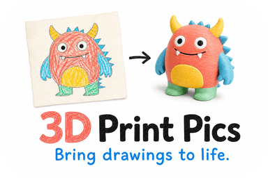
Kids color with crayons and markers in bold, uneven strokes. The charm is in those lines. The best conversion keeps that look: a bright body color with a darker color for the outline features, or a single saturated color that matches the dominant crayon in the original.
Two tips help here. First, choose colors with clear contrast between the main shape and any details such as eyes, spots or stripes. Second, if the drawing uses many colors, pick the two or three that carry the personality and let the others go. Our guide to turning a drawing into a 3D model covers how the shape is built from your image.
Pet photos
For a pet, think about what makes the animal recognizable. A black cat with white paws needs two colors to read as itself. A golden retriever works well in a warm tan or gold. If you can only choose one color, pick the one that covers most of the coat, then check the preview to see whether facial features still stand out.
Logos and mascots
Brand colors matter, but print colors will not match a screen or a Pantone swatch exactly. Plastic color depends on pigment, finish and lighting. If you need an exact match, treat the preview as a close approximation and choose the nearest available shade. For desk items and giveaways, a bold two-color combination that echoes the brand usually reads better than trying to reproduce every gradient.
Tabletop miniatures and school projects
If you plan to paint the model yourself, choose a light, even color such as white or grey. Paint covers it cleanly, and you can see the shape while you work. If you want to display the piece as printed, pick a mid-tone that shows shadows. Our post on paintable 3D prints explains how to prepare a photo and what to check in the preview.
Gifts
Gifts are about emotion, not accuracy. Choose the recipient's favorite color, a team color, or a color tied to the memory. A single well-chosen color often looks more polished than a mix of five.
How multi-color printing works, and where it breaks
If you want more than one color in a single object, there are two main routes.
Manual color changes. The slicer can schedule a filament swap at a specific layer. The printer pauses automatically when it reads the color-change command and prompts you to swap filament. This works well for flat-topped designs where color changes by height, such as a badge with a base layer and a raised top layer.
Automated multi-material systems. Here the printer switches between several filaments by itself. In the slicer, you can paint regions with brush, bucket fill and smart fill tools. The Prusa documentation on multi-material painting describes how the software segments the object so each region maps to a color.
The catch is thin detail. The same documentation notes that delicate features can fail in multi-color mode, because two materials cannot bind properly in a space smaller than the nozzle diameter. In practice, that means:
- Thin whiskers, antennae or tails in a second color often print poorly or break.
- Tiny text in a contrasting color may blur into its background.
- Sharp color boundaries on a thin wall are risky, so simplify the transition.
If your design has thin parts, it is often better to print in one strong color and keep the fine features intact. For a deeper look at which setup fits photos, parts or keepsakes, see our article on multicolor 3D printing.
Choosing the material along with the color
Searchers often ask about materials in the same breath as colors, and the two are linked: the material limits the available shades and finishes.
PLA is the standard for decorative prints. Simplify3D describes it as the go-to material for most users because it is easy to use, dimensionally accurate and low in cost. It comes in the widest range of colors and finishes, which is why most keepsakes use it.
PETG is a better fit for items that face moisture, chemicals or heat. A study of PLA and PETG in water found a mean weight increase of about 2.5% for PLA after eight weeks, compared with roughly 0.3% for PETG. For a shelf ornament that gap is irrelevant. For something that lives near a sink or outdoors, it matters.
Resin processes give very fine detail and come in their own color ranges, but they involve different handling and post-processing. They are a different category from filament keepsakes.
A quick rule: if the piece will sit on a shelf, desk or classroom table, choose PLA and spend your attention on color. If it will get wet, hot or handled outdoors, talk about PETG first and color second.
A note on safety and food
Do not use a decorative print as a cup, plate or food container, whatever the color or material. Researchers reviewing 3D-printed food applications note that standard desktop prints have internal voids and micro-geometries that can harbor bacteria, and that drinking or eating containers are not recommended unless certified food-safe materials and specific post-processing are used. If you are asking whether a PETG mug is safe, the answer for ordinary printed parts is no. We cover this in more detail in our post on why 3D prints are not food safe.
If the piece is for a child, "non-toxic" is a helpful label but not a blanket guarantee for every situation, such as chewing, heat or sanding dust. Our guide to non-toxic PLA at home and school sets out the practical limits.
How we think about color at 3D Print Pics
We see the same pattern again and again with photos and drawings: people want to add more colors than the shape can support. A child's drawing has seven crayon shades, a pet photo has a dozen tones, and the instinct is to reproduce them all.
Our view is that color should serve recognition. The first question is not "which colors are in the image?" but "which colors make someone say, that's my kid's dragon, or that's our Biscuit?" Usually, that's one dominant color and one accent. Everything else is decoration that can crowd the shape.
That is why we built the process around a preview. You upload your image, choose a color, and see the 3D model before we print. If the eyes vanish against a dark body, you change the color, not the whole order. If the proportions look wrong, you catch it before material is used. We offer up to 7 color choices in non-toxic PLA, which is enough to cover the realistic range: a neutral, a few warm and cool tones, and a contrast color. Our post on what to check in a 3D print preview lists the things we tell customers to look at.
One more thing we tell parents and teachers: keep the original. The print is a way to hold a memory in your hand, and the paper drawing is still the original. Color choices on the print can be playful because nothing is lost.
— Ian
A simple process for choosing your color
- Decide the purpose. Is this a shelf keepsake, a desk giveaway, a classroom model or a gift? The purpose narrows your choices fast.
- Pick the dominant color. Look at your image and choose the one color that covers the most area or defines the subject.
- Choose a contrast for details. If the design has eyes, text or small features, check that your color leaves them visible. A very dark body can swallow them.
- Prefer opaque and matte-leaning shades for display pieces, since they hide layer lines and show detail.
- Keep thin parts single-color. Whiskers, tails and fine lettering are the places where color boundaries cause trouble.
- Check the preview. View the model from several angles, not just the front.
- Decide on painting. If you plan to paint, choose white or light grey. If not, choose the final color now.
Worked example: a child's drawing of a dog
Say your seven-year-old drew a purple dog with a yellow collar and big black eyes. Printing in purple only keeps the character. If the preview shows the eyes disappearing, switch to a lighter purple, or pick a mid-tone where shadows define the eye sockets. If you want the collar to pop, a second color helps, but only if the collar is thick enough to print as its own region. If it is a thin line, it is better left as part of the body color and painted later with a paint pen.
Worked example: a business logo
A bakery with a cream-and-brown logo wants desk pieces for customers. Printing the whole logo in a single warm brown looks consistent and bold. Adding a cream second color on thin lettering risks the boundary problem, so the better move is a chunky raised shape in one color, with the lettering readable through its relief.
Ordering with us
If you have a drawing, a pet photo or a logo and want to see it as a real object, you can upload your image and order a custom 3D model. You choose the color and size, approve the preview, and we ship the print to your door. Custom 3D models are priced from $49.99 to $77.99 depending on the model, and rush processing is available for an extra $10. For how the ordering steps flow, see how to order custom 3D prints with your model, and for classrooms and PTAs, our guide to school 3D printing.
Common mistakes to avoid
- Choosing color from a screen alone. Screens glow; plastic reflects. Expect a small shift.
- Using too many colors on a small piece. The smaller the print, the fewer colors it can carry.
- Picking black for a detailed figure. Fine features can disappear into shadow.
- Ignoring finish. Glossy and matte versions of one hue look different on the shelf.
- Expecting translucency to look like glass. Translucent plastic is cloudy, and it shows the internal structure of the print.
- Skipping the preview. It is the cheapest place to fix a problem.
FAQ
What are the best colors for 3D printing?
For display pieces, opaque mid-tones and light colors such as grey, white, tan and soft blue show detail best. Bright primaries suit kids' art and mascots. Very dark colors look sleek but can hide small features, so check the preview before committing.
How do you 3D print in different colors?
There are two main ways. You can schedule a filament change at a particular layer, which pauses the printer so a new color can be loaded, or you can use a printer with automated multi-material switching and paint regions in the slicer. Thin details are the usual failure point in either method.
Does PLA or PETG paint better?
PLA is the usual choice for decorative pieces you plan to paint, since it is easy to print and finish. PETG is chosen mainly for moisture, chemical or heat resistance. If painting is your goal, start with a light, even PLA color and prime it before applying paint.
Is PETG okay to drink out of?
Not for ordinary printed parts. Standard desktop prints have tiny internal gaps that can harbor bacteria, and researchers advise against using them as drinking or eating containers unless certified food-safe materials and special post-processing are used. Treat printed keepsakes as display objects.
How many colors can I choose at 3D Print Pics?
You can choose from up to 7 colors in non-toxic PLA, and you see a 3D preview before your order is finalized. If a color does not work with your image, you can change it at that stage.
Sources
- The Science of Choosing 3D Printing Material Colors, Formlabs
- Color change, Prusa Knowledge Base
- Multi material painting, Prusa Knowledge Base
- Ultimate 3D Printing Materials Guide, Simplify3D
- Degradation and Absorption Behavior of PLA and PETG, PMC
- Three-Dimensional Printing of Foods: A Critical Review, PMC